
 Figma
 Zeplin
 Storybook
 MUI
 TailwindCSS
 React
 Github
 Jira
 Miro
 Slack
Context
Mention is a B2B SaaS platform for media monitoring and social listening: it lets companies track the web and social networks, analyze online conversations, and manage their social presence — all in one tool. I was the sole designer, working directly with the product managers and developers.
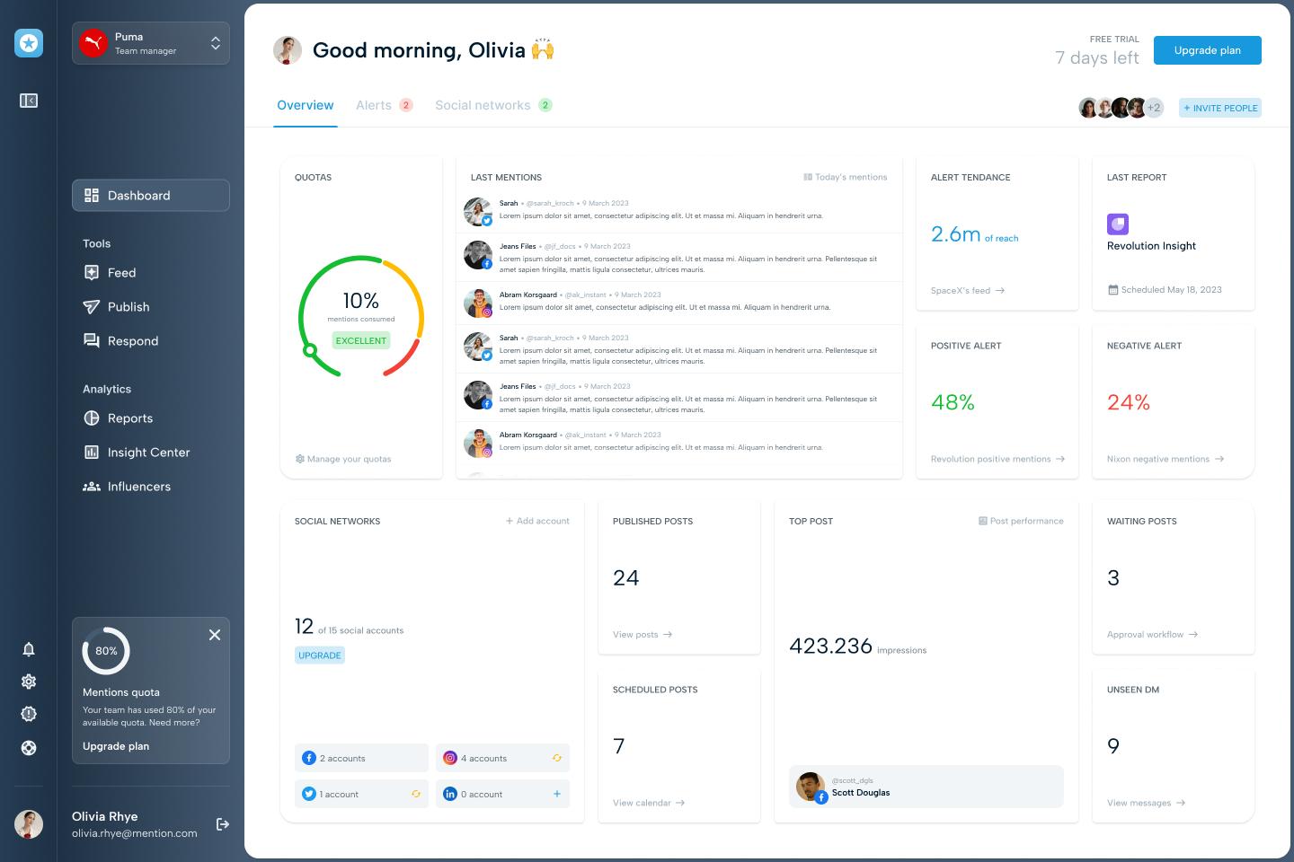
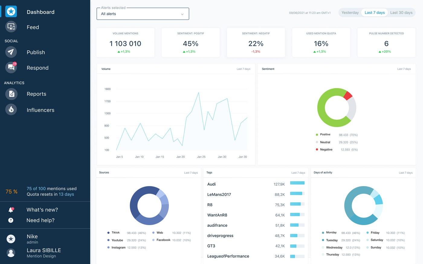
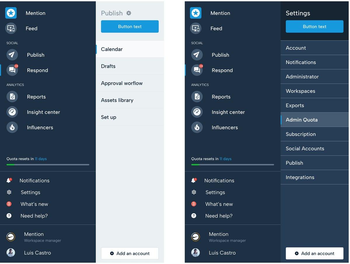
The product ran on Material UI, dressed with a thin CSS layer to swap out the colors. On the design side, there was no UI kit — only scattered Figma mockups. Neither design nor code had a shared source of truth.
The problem
Without a shared system, every team worked in isolation — and design stayed at the end of the chain, never present where product decisions were actually made.
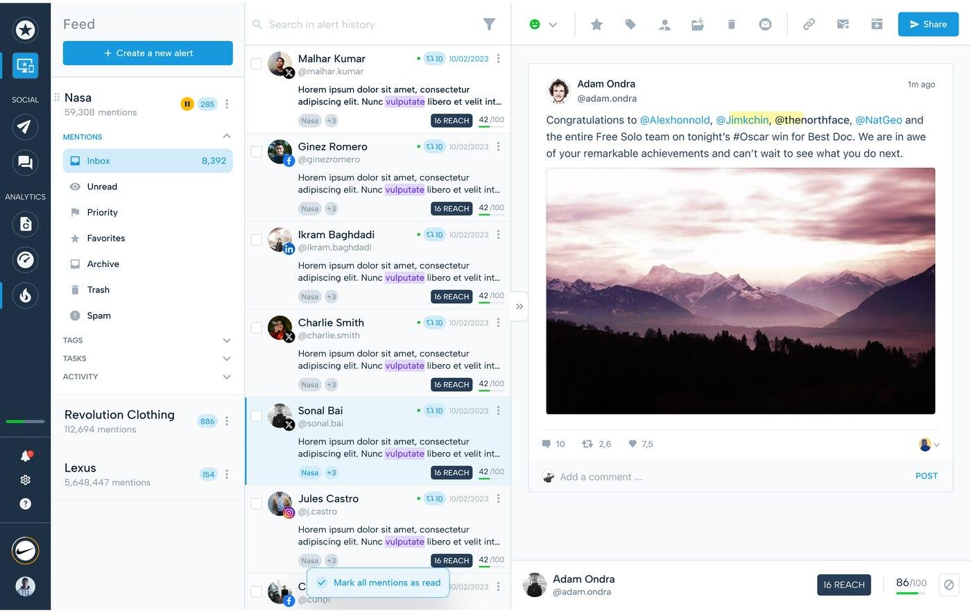
On the design side, mockups lived in a catch-all Figma file, undocumented, where anyone could overwrite anyone else's work. No UI kit, no rules — just stacked screens.
On the development side, components didn't really exist. The pattern was copy a piece of code that was already running in production, paste it into the current screen, adjust the style to match the mockup. No structured, documented component — just duplication. Colors were hardcoded and scattered across HTML, CSS, and those pseudo-components, with Material UI disappearing under layers of patched CSS.
Between the two, there was no handoff. Delivery meant dropping a Figma link into a Jira ticket, with no context and no intent. The cost showed up at the end, in review: front-end feedback and test cycles accumulated to the point where a user story could consume as much time in corrections as had been estimated to build it.
The result wasn't just visual inconsistency from one screen to the next. It was a team spending its energy patching and redoing, instead of designing.
The mandate
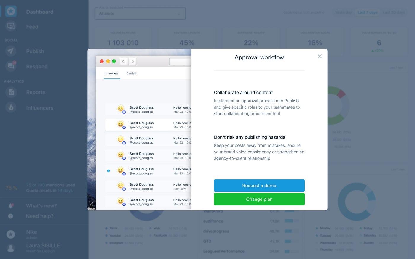
I wasn't hired to tidy a Figma file. The Head of Product brought me in with a clear objective: get design into product decisions. Until then, design had been executing choices made upstream by PMs and developers. The goal was to make it a voice in its own right — and, more broadly, to spread a design culture: first in the product team, then with developers, then across the company.
The design system wasn't the end goal. It was the means: concrete ground for closing the gap between design and development, and establishing a shared way of working.
The audit
Rather than starting with components straight away, I began with a full assessment: the Figma file, the production UI, the overall UX, the team workflow, and the handoff. The goal was to understand where time and consistency were being lost before deciding what to change.
That audit led to an action plan running on two parallel fronts. With the Foundation squad — the team responsible for the product's technical foundations — the system front: a UI kit shared between design and code. With the PMs, the collaboration front: a shared approach to framing, documenting, and handing off work.
The approach
The plan advanced on two fronts at once. First, bring teams together around a common way of working. Then give them the technical foundation that would make it last.
Front 1 — A structured collaboration (with the PMs)
Normalizing Figma files. As long as design lived in a catch-all file where anyone could overwrite anyone else's work, no source of truth was possible. I gave the Figma files a consistent structure — a predictable organization where everything had a place, and where you could find the actual state of a screen without having to ask.
Defining "done." The endless review cycles came from a disagreement that had never been made explicit: what did a finished mockup actually mean? A shared Definition of Done settled the question upfront. A design wasn't handed over until it covered every state — default, empty, error, loading. The debate happened before development, not after.
Rebuilding the handoff. A Figma link dropped into a Jira ticket transmits neither intent, nor decisions, nor the cases that need to be covered. I rebuilt the handoff end to end.
Zeplin became the "ready to dev" gateway: a staging area where only validated mockups entered, accompanied by their specs, serving as the single source of truth for all teams.
On the Jira side, I put in place a workflow and ticket templates that explicitly connected design and development. A parent ticket carried the product objective — a feature, a problem to solve. Under it, design user stories each held the design context: a link to discovery, UX research, user feedback, the list of cases to produce, a Definition of Done covering all states, and a prototype when needed. Dev user stories were attached to one or more design user stories: the developer found the context, decisions, and comments there, along with the Zeplin links and a reference to Storybook when the component was documented.
The handoff stopped being a wall between two teams. It became a continuous thread — from the product problem to the integrated component, each link carrying the context of the one before it.
Front 2 — A foundation shared between design and code (with the Foundation squad)
Starting from what existed, not from a blank page. The product ran on Material UI. Rather than forcing a brutal rework — risky, and experienced as a rejection by the developers — I kept Material UI as the base and redesigned it: a Figma UI kit that preserved the components already in place, but reworked, drawing on the principles from Refactoring UI and Practical UI.
Putting an abstraction layer between style and components. Hardcoded colors scattered across HTML and CSS made any change risky and manual. By introducing Tailwind CSS and its design tokens, styles stopped being written out everywhere: they passed through an intermediate layer, editable in one place, propagated everywhere.
Building components with developers, not for them. A design system delivered as a finished product would have been worked around like everything else. The components were built with the front-end developers, to fit into their process and become their tool — not another constraint imposed from above.
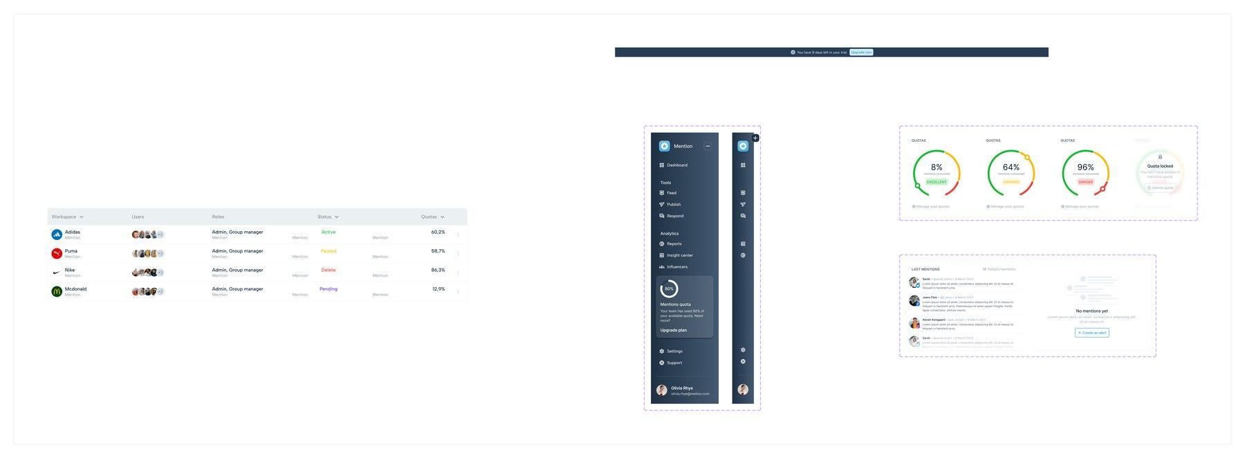
Documenting to make the foundation accessible. A system nobody knows how to read isn't a shared system — it's just another folder. Storybook gave the components a living, documented library that anyone could consult. Crucially, through Storybook's Designs addon, each component was linked to its reference Figma mockup: the mockup appeared directly in a "Design" tab, next to the real component. Designers and developers were finally looking at the same object, described in the same place, without switching between tools. The library also served as an entry point for new front-end and fullstack developers: rather than trawling scattered code to understand what existed, they had a clear catalog — which noticeably accelerated their ramp-up.
Results
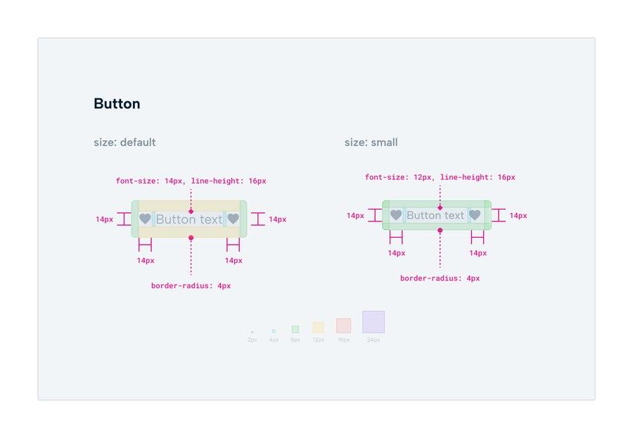
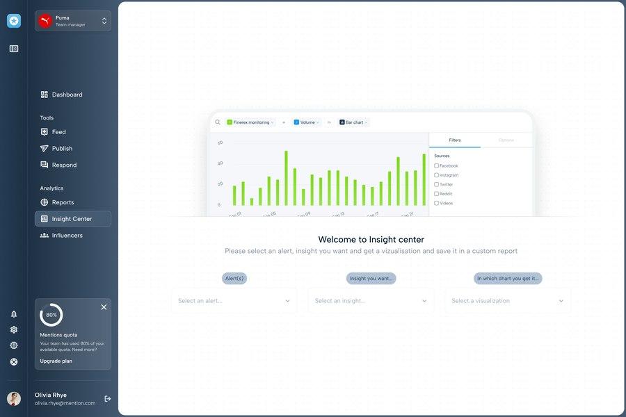
A shared source of truth. Designers, PMs, and developers were finally working from the same references: a Figma UI kit, a documented component library, validated mockups. The UI kit covered the full scope of Material UI — around 100 screens across three breakpoints: desktop, tablet, and mobile.
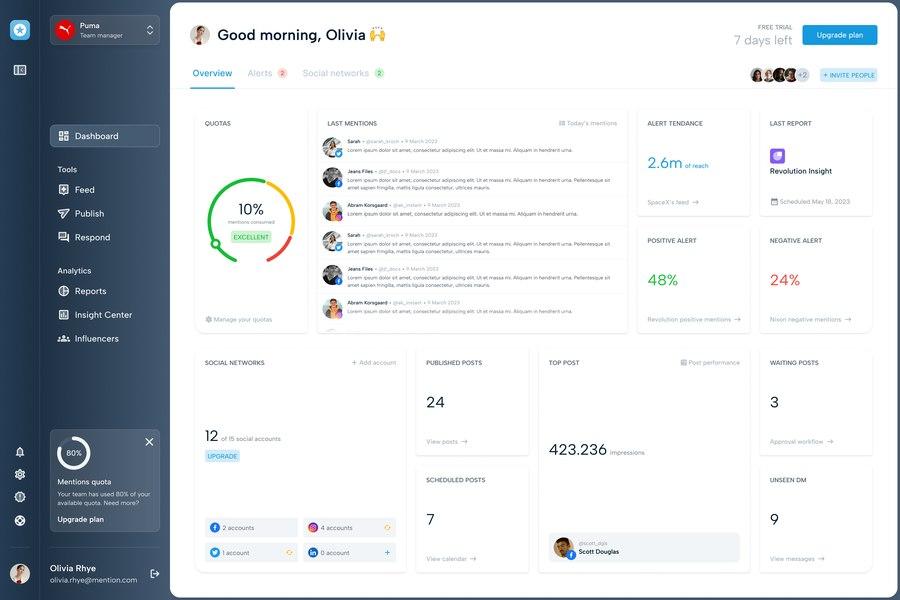
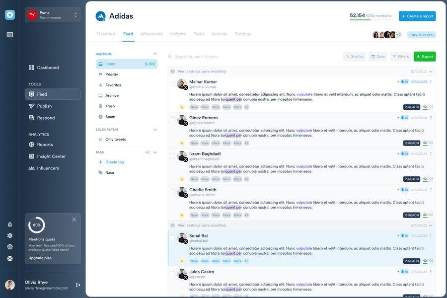
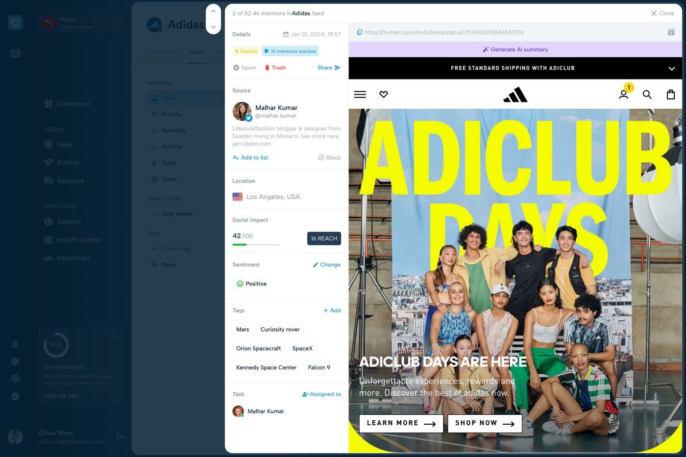
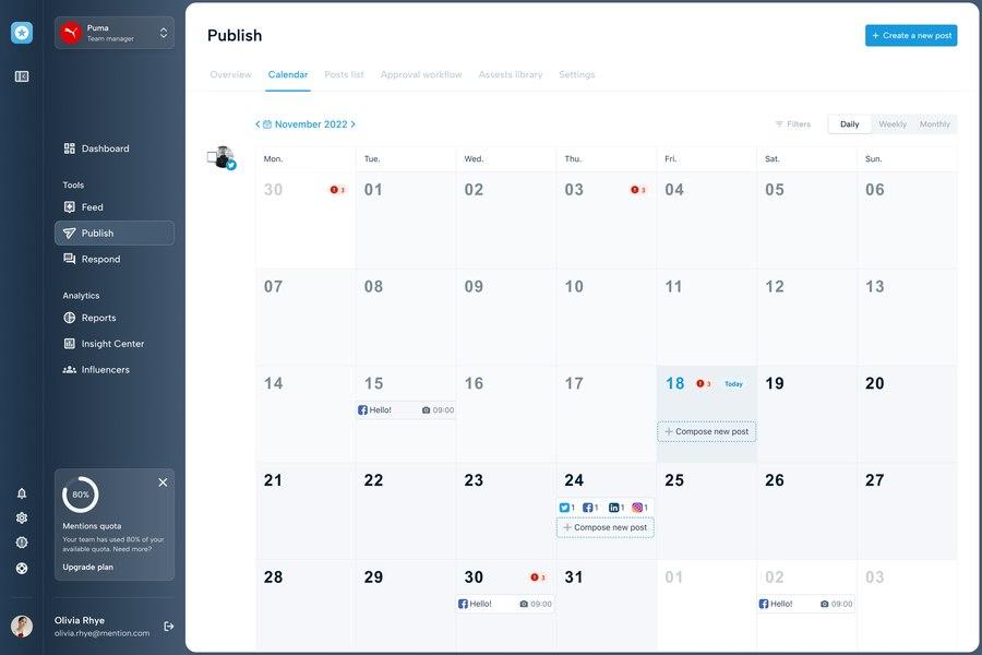
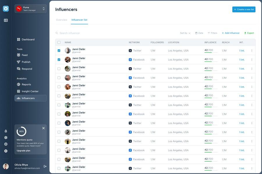
Less friction, less rework. The endless review cycles dried up. With a shared Definition of Done and structured components, the debate happened upstream, not at the end. Components, tested once at the library level, no longer needed to be re-checked at every feature — which noticeably reduced the production-testing load.
Design integrated, not just executed. That was the mandate. The workflow connected product context to design user stories, then to dev. Design no longer arrived at the end of the chain — it was present where decisions were being made. Visual consistency also extended beyond the product, aligning the interface and the marketing materials.
Time returned to design work. By stopping the patching cycle, the team recovered time for what actually matters: discovery, UX research, R&D. It even became possible to build quick POCs to validate a feature idea before committing to it.
What I take from it
A design system is a social tool before it's a technical one. The hardest part wasn't drawing components or structuring tokens — it was making a shared way of working actually stick. Building components with the developers rather than delivering them made the difference between a living system and an ignored library. I'd approach it the same way today.
Tools date; principles don't. At the time, Zeplin was the right choice for a "ready to dev" gateway. Since then, Figma's own evolution — sharing modes, Dev Mode, integrated specs — has made that intermediary obsolete: today I'd let Figma play that role directly, without the third-party tool. What mattered wasn't Zeplin. It was the function it served: a clear boundary between "in progress" and "ready to build." That function is still necessary.
What I carry forward. This project confirmed what I'm actually interested in: not the design system as an end in itself, but what it enables — connecting design, product, and code in the same movement. That's become the thread running through my practice.