
 Figma
 Zeplin
 Storybook
 TailwindCSS
 React
 Github
 Jira
 Slack
Context
eKonsilio is a B2B SaaS for conversational marketing — chat windows embedded on client websites, conversations routed across web, social, and SMS, and a backend tool for the advisors handling those conversations on behalf of brand clients. Lead capture and reporting close the loop.
When I joined in November 2019, the company had just put a first version in production. Below the surface, almost everything still needed to be built.
The problem
A few months earlier, a digital agency had delivered the first version of the product on top of an off-the-shelf admin template — the kind that was everywhere at the time. The front-end didn't hold up: interactions stuttered, the UI bent under its own weight, and the codebase was a thicket of template defaults nobody had touched on purpose. We were going to rebuild on top of it anyway.
The product's real problem was bigger than the front-end. The "platform" was a stitched-together stack of third-party services running side by side. LiveChat for the chat tool itself — both the advisor-facing interface and the chat windows embedded on client sites. HubSpot for lead management. Manual Excel and CSV exports, plus PDF reports, for everything analytics-shaped. The company had outgrown the bill, the integrations, and the gaps between them. The mandate was to internalize the whole thing — to build, from scratch, the platform that all those services had been standing in for.
I was brought in to make that platform exist as a real product, not a Frankenstein of internalized features. UI, design system, front-end. A fullstack developer would own the back end and the infrastructure. We were two.
Act 1 — The POC (October–December 2019)
The first job was to make the existing version stop being a liability. The POC had to ship — it already had — and then keep running while we figured out what came next.
I arrived as the first version was being stabilized in production. Mockups were a luxury we didn't have, and a tool I didn't yet have either. I designed directly in the browser, in the code, on top of the inherited template. Find a usable shape inside the Material UI defaults, override what couldn't stay, leave the rest until the next pass. It wasn't elegant; it shipped.
In parallel, on my own time, I started testing Figma. The timing turned out to matter: on December 5, 2019, Figma released Auto Layout — the feature that would let design systems exist as living systems instead of static screenshots. The modern foundations of design system work were arriving in the tool just as we were about to need them.
By the end of December, the POC was running. It was also clear it couldn't be the product. What we'd inherited had carried us to production, but no further.
Act 2 — The reconstruction (January 2020)
Erased everything. Keep the best, avoid the POC's mistakes.
January was a reset. Figma as the design tool, from a blank file. React as the front-end framework. And underneath, a design system built from scratch — not adapted from an existing kit, not refactored from inherited code, but designed and written from the foundations up.
Choosing the stack as if the team was already there
The most consequential decision of the rebuild was Tailwind CSS. In January 2020, Tailwind v1 was eight months old and still arguing for itself in the front-end community. Utility-first wasn't yet the default mental model it would become.
I picked it for one specific reason, and it wasn't technical taste. I'm comfortable in plain HTML, CSS, and JavaScript; any stack would have worked for me. The decision was about the team that didn't exist yet.
A small startup grows by hiring fullstack engineers, not front-end specialists. Front-end specialization narrows the hiring pool and concentrates the maintenance risk in one person. If the system was going to outlive me — and it had to — it needed a styling layer that a fullstack developer could pick up, contribute to, and maintain without inheriting someone else's CSS architecture.
Tailwind solved that. Style stayed in the markup instead of drifting into stylesheets nobody owned. The documentation was already good enough to onboard a developer in an afternoon. The class names read as HTML to anyone. And the token layer the framework was built around was exactly what a design system needed underneath: a finite, named set of design primitives that the rest of the system could compose from.
It was a decision about a team I hadn't met yet. It held up.
A design system, built from the foundations
With Figma's Auto Layout in hand and Tailwind underneath, I built a real design system — the first one I had the time and the tooling to build properly.
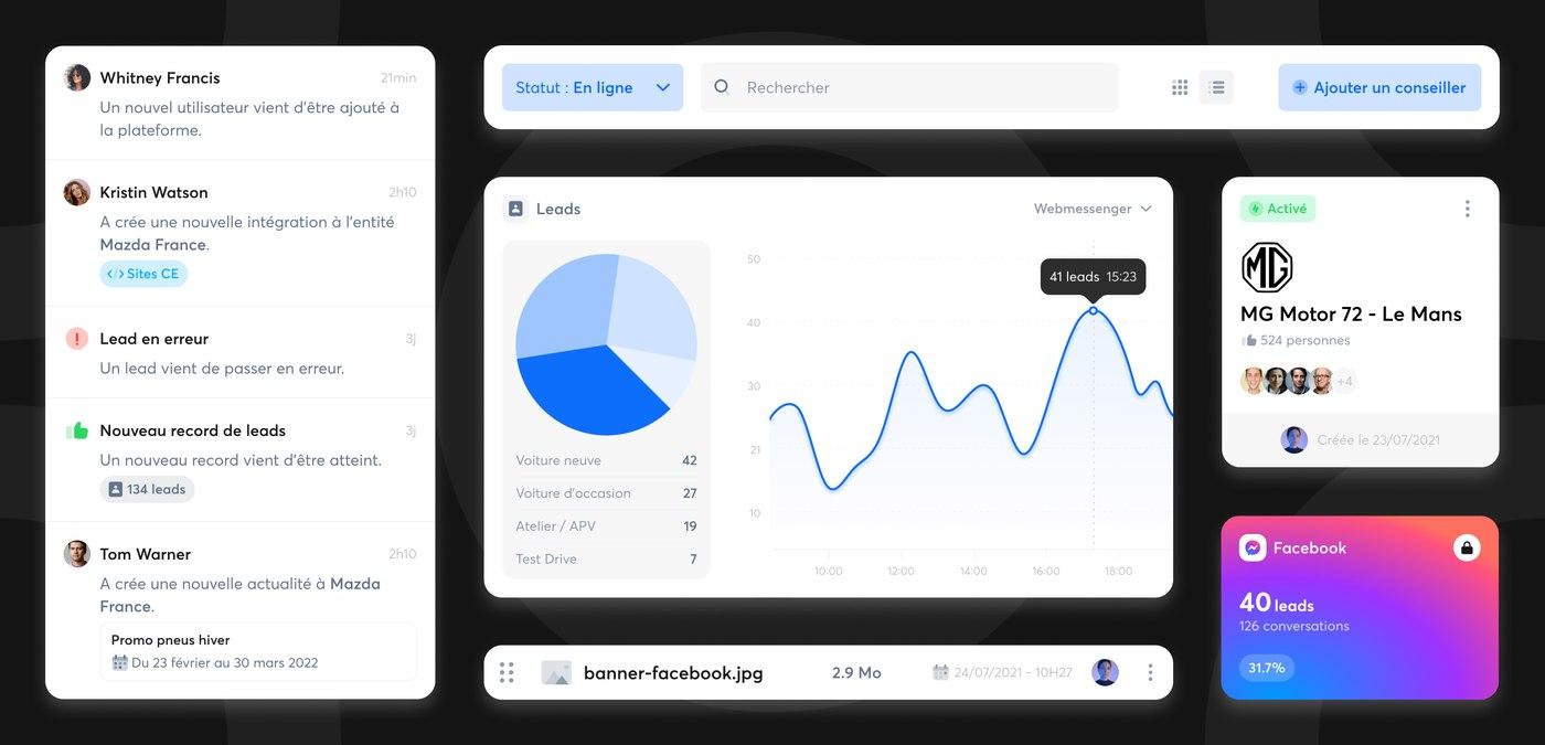
Foundations first: color, typography, spacing, radius — the tokens that everything above would consume. Both as Figma styles and as Tailwind theme extensions, mapped one-to-one so the design file and the codebase were speaking the same vocabulary, with no translation step between them.
Then the primitives: buttons, inputs, badges, links, the small set of elements that show up everywhere. Each one designed with its full state machine — default, hover, focus, disabled, error — and each one built in React the same way. Storybook caught the components as they landed in code, documented their variants and props, and doubled as the living catalog of the UI kit. Designers and developers had one place to see what existed.
For the mockups themselves, Zeplin sat between Figma and the developer. Once a screen was validated, it crossed into Zeplin as "ready to dev" — specs intact, no ambiguity about what was still in motion and what was settled.
The product, built on top of the system
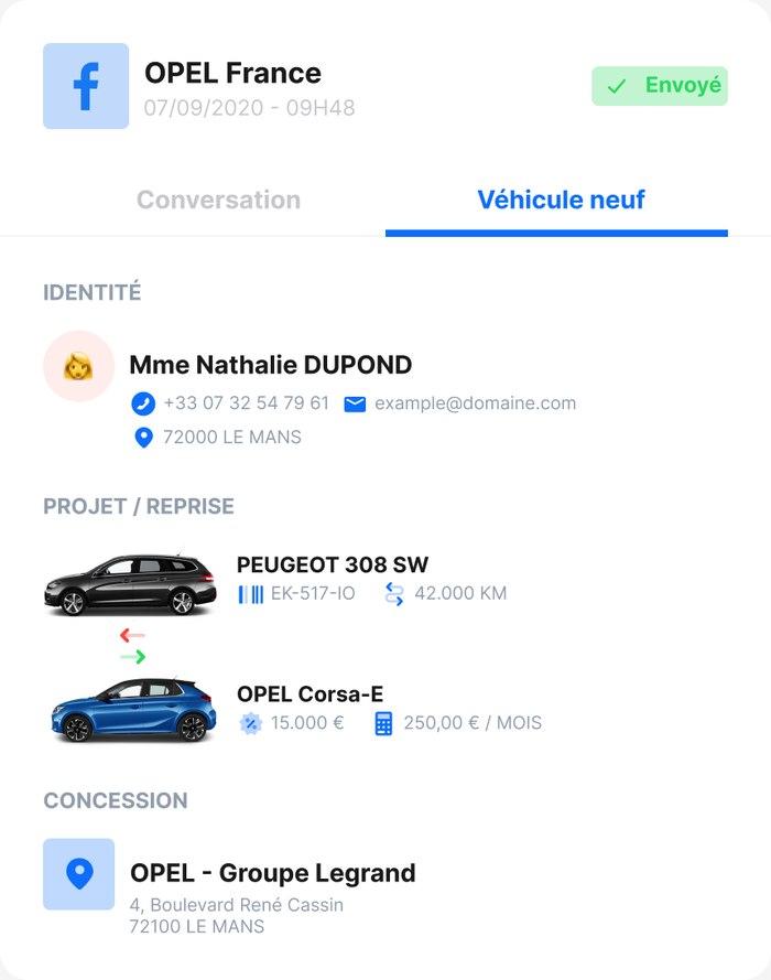
With the system in place, the product itself came together. The chat tool first — the advisor interface and the chat windows we embedded on client sites — replacing what LiveChat had been doing. Client and advisor management. Lead capture, replacing HubSpot. Reporting and dashboards, replacing the Excel exports and the PDFs.
Through 2020, the design system held the product together. I designed the screens, built the React components, and worked on the integration of the front-end into the app. The fullstack developer owned everything I didn't — backend, infrastructure, deployment. The boundary held cleanly throughout.
Act 3 — Scaling up (September 2020 – August 2022)
In September 2020 — about nine months after the rebuild — the team began to grow. A second fullstack developer arrived, then a third. By mid-2021 the engineering team was around five fullstack developers, plus a product manager.
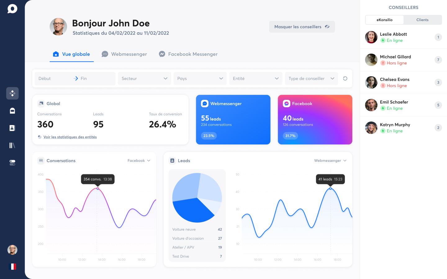
The shift in my role didn't happen as a decision. There was no moment where I declared I was stepping back from the code. The product grew, which meant more screens to design, which meant more components to maintain, which meant more documentation to keep up to date. My time slid, gradually, from production work to consolidation work.
The arrival of the PM is what changed the gravity of my days. Until then, every feature passed through me from idea to mockup to component to deploy. With a PM owning the upstream and an engineering team owning the downstream, my center of gravity moved toward the middle: the design system, the mockups, the documentation that kept the new developers fluent in the system.
I kept a foot in the front-end. Responsive work, animations, the moments where a feature had a complex front-end and benefited from a designer's hand on the keyboard, the rush periods where shipping mattered more than role boundaries. The hybrid didn't end — it became a lane I could enter when the team needed it, instead of the default mode of every day.
What I'd bet on in January 2020 was now visible in plain sight. The design system was being maintained by people who weren't me. New developers — fullstack, not front-end specialists — ramped up on the codebase without needing a CSS architecture explained to them. The system held its shape as the team that built on top of it doubled.
Results
A POC became a product. What started as a stitched-together front-end on top of agency-delivered template code became, over two and a half years, an internal product that replaced the third-party stack it had been hired to retire. LiveChat, HubSpot, the Excel exports — all gone, or kept only where the internal tool didn't yet cover the case.
A design system that outlived its first author. When I left in August 2022, the system was being maintained and extended by an engineering team I hadn't been part of hiring. New components were being added without me. The tokens were still the tokens. That was the bet of January 2020 paying out — a system designed to be picked up by people who weren't front-end specialists, in a tool stack that didn't ask for translation between design and code.
A workflow that absorbed the team's growth. The design-to-dev handoff scaled from a two-person operation to a team of seven without breaking. Figma → Zeplin → Storybook → React, with the design system underneath the whole pipe, kept the cost of adding a screen roughly linear instead of compounding as the team grew.
No hard metrics to point to. We weren't instrumented to capture the numbers — adoption rate, time-to-merge, regression bugs avoided — that would tell this story in figures. The proof is in the shape of the system, not in a dashboard.
What I take from it
The dual design/dev hat is a shortcut, not a job description. It earned the product its first year — designing in the browser meant the POC could be stabilized while the rebuild was being planned, and the design system could be coded as it was being drawn. But that hat has an expiry date. When the team arrives, the right move is to let the front-end widen its base and step back into the system layer. Holding the hat too long would have made me the bottleneck I'd been hired to eliminate.
Build the system before you know where the product is going — that's the easy part. Counterintuitively, the best moment to build a design system is when the product is still small enough that the constraints are simple. Two months in, you don't have ten years of accreted decisions to retrofit. The foundation gets to be clean, the token set finite, the components few. By the time the product complicates — and it will — the system already exists. Bolting one on after the fact is what's hard.
A scope doesn't shrink with the team; it changes. As a founding designer, the scope starts at everything no one else is doing. When the team grows, that scope doesn't get smaller — it shifts. From "do everything" to "do what no one else will do." First the front-end ends up in better hands than mine; then the upstream gets a PM; what stays is the layer connecting them — the system, the mockups, the documentation. The role isn't being diluted. It's finding its real shape.